A mixture of vibrant elements that highlights our Latin culture in Canada
In December 2014 Camilo Londono, Marketing Manager (2014 – 2015) developed for us a corporate image more contemporary and proud of our heritage. Take a look at the inspiration behind our brand
We started with the basis, creating a symbol that defines the geographic region where Latin Americans come from: North, Central and South America. The 3 triangles in red, blue and green are a geometric and abstract representation of the western hemisphere, zone of our native ancestors, our European and African roots and home of more than 650 million Latinos.
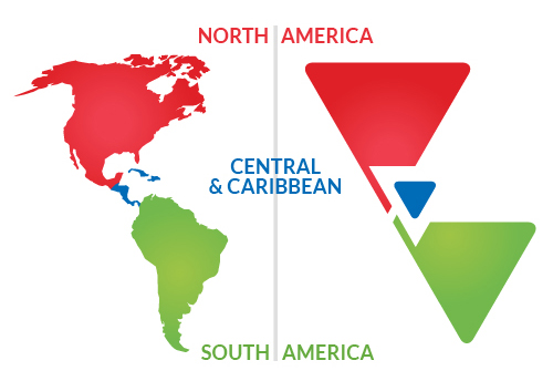
The colour pallet selected illustrates the common tones of each region’s flags and landscapes.
The inspiration behind the triangles comes from the geometric patterns used by 3 of our aboriginal civilizations’ cultural identities – Aztecs, Mayans and Incas.
![]()
The lower case text with the acronym CALA represents an innovative and contemporary way to identify our corporate brand, that is enhanced by the red maple leaf; a recognized icon of the Canadian identity.
The combination of the triangles from Latin American’s aboriginal art, our name’s contemporary look and the maple leaf represents, all together, our mixed Latin American community in London which thrives to expose its cultural heritage.